Renascent Protection Solutions
Logo Design / Brand Identity
Renascent Protection Solutions was previously Allegiance Administrators. After internal issues and law cases, the company decided to rebuild from the inside out, calling for a needed rebranding and logo design under their new name.
Renascent requested:
Branding that reflects their rejuvenation and rebirth.
Initially to steer away from their previous colors blue and gold.

Previous Logo
Conceptualization
Inspired by their story and desire to showcase revolution and revival in their branding, I started to research symbols and elements that represent rebirth. I played with elements from water, phoenix, and flowers. Collaborating with another designer, the shield brandmark came together from an initial flower design.
Color palettes were inspired from water images and impressionist paintings of spring and fall.

One of the finished initial concepts.
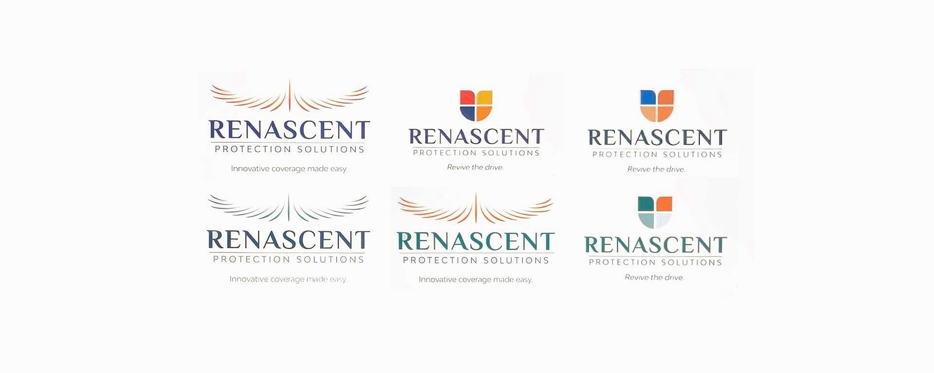
Client liked the blue and requested a monochromatic color palette. A san serif font was replaced for “Renascent”. Final logo design completed.